This typeface was designed with biological and monstrous forms as its motif. The organic and chunky stems paired with sharply truncated sans-serif…
Droit is a distinctive display typeface characterized by its straight, fragmented lines that form round and diagonal shapes. The typeface creates a…
CHOOSE YOUR WEAPON DUMP HIM ... they just hit different written with a font made of Sextoys.
This typeface is based on stone-carved letterforms used for an 1871 gravestone for Jean Jacques Lallelment, located in a small cemetery in…
(this was mistakenly sent under the wrong name Droit, resubmitting here...) The glyphs in this typeface, comprised of over 100 handprinted monoline…
Droit is a distinctive display typeface characterized by its straight, fragmented lines that form round and diagonal shapes. The typeface creates a…
Julia Skopnik uses classic as well as experimental photographic methods in her color darkroom to create graphic images. She is currently using…
»Letter S« illustrates the essence of paper. Flexible, tear-resistant, absorbent – versatile for graphic design. Fragile individual sheets develop changed properties through…
This is an ongoing project exploring the possibilities of using a pen plotter, a type of drawing robot, for typographical purposes. By…
NOF4 is a display font based on the graffiti of Fernando Oreste Nannetti, a patient at the Psychiatric Hospital of Volterra, etched…
Artificial intelligence helped me find solutions that aid the viewer in searching. Searching and observing closely.
How might typography look at the biological level? I played around with this idea a bit using artificial intelligence.
The “Felsen” font or rather its character set consists of six basic forms that are programmed to compose each character. Random parameters…
All the works I present here are a blend of human creativity and artificial intelligence. The rhythms and forms are the result…
To highlight the sharp decline in lichen populations, five asemic sign systems are created to give them a voice. These systems are…
»Flextron« is a modular font system for experimental use. Monospaced and extremly reduced to a minimum of three to five elements per…
The poster about selfish in the modern world. Typographical explosion, controlled chaos, and unconventional censorship using Latin alphabet letters.
Design allows me to break, unlock and create barriers. Digital, analogue, three-dimensional, two-dimensional, meaningful, meaningless.
This experimental typeface was inspired and shaped by cross-stitch embroidery. The aim was to use this traditional method and integrate it into…
This is a series of illustrations I created for Road & Track Magazine to accompany a special feature on iconic 90s supercars,…
The designer used Google Spreadsheets as a canvas to create a clockface that addresses the issue of climate crisis. By utilising the…
Each artist communicates with the outside world in their own way. They strive to express their thoughts, ideas, and emotions through colors,…
Numerals: A language that weaves the fabric of time. A figure that captures the first met, making the days and months in…
"Repetitive Tricks" is inspired by training sessions with Chen’s dog, TOTO. It captures the repeated gestures and vocabulary used in practicing the…
Upcoming Events

26.09.2024 –
31.12.2025
RÅW
Trapholt Museum of Modern Art, Kolding, Denkmark
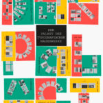
22.02.2025 –
11.05.2025
Der Palast des typografischen Mauerwerks
Museum für Angewandte Kunst, Frankfurt am Main

01.03.2025 –
30.04.2025
Mut zur Wut 2025
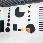
09.04.2025 –
29.04.2025
Collective Cosmo: SET v.26
Gallery of the HBKsaar, Keplerstraße 3-5, 66117 Saarbrücken

01.05.2025 –
04.05.2025
21st Pictoplasma Conference
silent green Kulturquartier, Gerichtstraße 35, 13347 Berlin

08.05.2025 –
10.05.2025
DIVE’25
Fat Cat in Munich, Germany
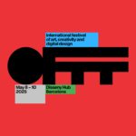
08.05.2025 –
10.05.2025
OFFF Festival 2025
Disseny Hub, Barcelona, Spain
09.05.2025 –
01.06.2025
Design Month Graz 2025
Graz, Austria
10.05.2025 –
18.05.2025
munich creative business week 2025
Munich, Germany
31.05.2025 –
31.05.2025
TypeParis Now 25
Novotel Paris Vaugirard Montparnasse 257 rue de Vaugirard , Paris

06.06.2025 –
06.06.2025
CXI Conference 2025
Bielefeld, Germany