We love to play with the typography in the 3D area pushing the boundaries and discovering possibilities with new media.
We love to play with the typography in the 3D area pushing the boundaries and discovering possibilities with new media.
This poster was created for the concert of the Swiss band „Prinz Kamal Khan“ at the Neubad Klub in Lucerne (CH). The…
This is a display modular typeface based on a 4x3 matrix. An ascetic matrix gives a great variety of forms and…
Ich sollte ein Logotype für eine KiTa gestalten und beschäftigte mich mit der Frage, wie Kinder, die noch nicht lesen können, Schrift…
Die LUNIK enthält 29 Schriftschnitte, einen für jeden Tag einer Mondphase. Die Schriftschnitte wurden mithilfe einer vereinfachten Nachbildung des Sonnensystems in CINEMA…
"jimmi gropp" mit sieben Schriftschnitte ("Monday" – "Sunday"). Entstand bei Experimenten in Photoshop.
«Pebble» Sochi Sea Pebbles Font, 2020. I have always been inspired by whimsical lines on sea pebbles. In April 2020, we found…
Parco Studio has designed the identity of CIG Arcigay Milano by matching two important elements: the typographic and the chromatic palette. The…
This piece is an exploration of how black and white gradients can be used to create letterforms. Light and dark values acted…
“Botanical Thriller” is a photography project by Cartacarbone. As part of the project we designed a custom lettering of the front cover…
Perfect is boring. It's the imperfections that show that there was a human involved. This is what makes something interesting.
Type experiments from a project exploring how to hide typography in plain sight. By blending upper case type in contrast with their…
A collection of twelve A4 posters called “I´ll rather not say” (Prefiría no decirlo). They are typographic compositions based on the pages…
I couldn’t stop staring at these letters with holes, so I made a poster dedicated to this magical font. I believe that…
The work is made up of a background of words where some are arranged straight and others upside down. Then on this…
It’s a playful attempt to create a digital sculpture with a focus on the material.
Concertato is a font family in which the variation of proportions and horizontal bar's height defines six styles each representing one of…
Fatboy was created as the final project of my CAS Fundamentals of Typography at the ZHDK, Zurich. For me, as a newcomer…
A Meditation on Type is an alphabet created between October 2019 and October 2020. This span of time marks a phase of…
These x-rays are part of a design research project that applies the steps of a root canal procedure to the story of…
«Galina»
Font from the city of Suzdal, 2021. During a two-day children's laboratory held in Suzdal in May 2021 children studied the…
Barbecue is a typeface plays with the 'terrible' alignment and patterns. The uppercases have lower baseline than the lowercases, so the letters…
Letters arise in the negative space
Upcoming Events

25.04.2024 –
22.04.2025
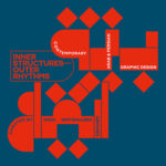
Inner Structures – Outer Rhythms

27.06.2024 –
05.01.2025
gggrafik design—slay allegories
Centre National du Graphisme, 1 Place Émile Goguenheim, 52000 Chaumont, France

20.07.2024 –
24.11.2024
Same Bold Stories?
Klingspor Museum,
Herrnstraße 80,
63065 Offenbach

31.08.2024 –
05.01.2025
German Design Graduates 2024
Museum Angewandte Kunst, Frankfurt am Main

04.10.2024 –
17.11.2024
FORMAT(S)
Strasbourg

23.10.2024 –
08.12.2024
Call for Submissions: Yearbook of Lettering 2

20.11.2024 –
21.11.2024
ADC Creative Club 2024
Design Zentrum Hamburg

28.11.2024 –
28.11.2024
DDC Salon NRW
NRW Forum Düsseldorf, Düsseldorf