In 2021, I had a commission design job to design numbers and arrows, which is mainly for the space of an exhibition.…
Squares, circles and triangles. Burn them all.
The specific design process started before the Covid-19 quarantine period, however it was completed within it. During the first quarantine period the…
'Generative Typography' is a free form visual exploring typefaces and design and testing typefaces within p5.js which is a JavaScript library for…
A chunky modular typeface, blocks of squares and right-angle triangles, grid spaced, grid set. Rules - this size, these shapes - initiate…
This display typeface was designed for a manufacturing and construction company to help with creating recognizable visual identity. The font is based…
"Island Invisible" is an exhibition representing Taiwan in the Prague Quadrennial. This name is intended to insinuate Taiwan's status in the international…
Fun experiment playing around with depth and isometrics. Nudging the words close to abstraction.
Exploring the whole alphabet through a set of isometric constraints. Where can each letter be pushed without losing its legibility?
Ausschlaggebend für diese experimentelle Schrift war die Annahme, dass jeder Buchstabe in ein Quadrat als Grundform passen muss und jeder Buchstabe selbst…
“MACHTLOS” (powerless) is an excerpt of a poster series about insomnia which I made a bookazine (“SOMNIA”) about. SOMNIA is a bookazine…
Everything started with a simple idea: -What are the limits of legibility? In this personal project, the aim is to experiment with…
Bureau Now created the typographic identity for the experimental film HYSTERESIS. The visceral film needed a warning about epileptic content and a…
As part of the 3rd module at the HSE School of Design, I worked on the creation of a modular accidental font…
BATAREYA is a modular display typeface. It is on the verge of the cold elegance of chromed metal and the brutality of…
Commissioned by Adobe to create Animate CC splash screen.
»Rekto« is a formal examination of the unused legacies of the printing industry that inevitably arise in every printing process: the waste…
// No Text ... comes asap // Liebe Clara, so sorry. Ich schick den Text bis Montag nach! Danke, Liebe Grüße, Petra
// no text yet, sorry - but asap // Liebe Clara, ich schicke Dir den Text bis Montag. Ich hoffe, dass ist…
As part of the centenary of the Bauhaus School this font was created for an exhibition in the HSNR Krefeld. The basis…
Upcoming Events
25.04.2024 –
22.04.2025
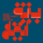
Inner Structures – Outer Rhythms

27.06.2024 –
05.01.2025
gggrafik design—slay allegories
Centre National du Graphisme, 1 Place Émile Goguenheim, 52000 Chaumont, France

20.07.2024 –
24.11.2024
Same Bold Stories?
Klingspor Museum,
Herrnstraße 80,
63065 Offenbach

31.08.2024 –
05.01.2025
German Design Graduates 2024
Museum Angewandte Kunst, Frankfurt am Main

04.10.2024 –
17.11.2024
FORMAT(S)
Strasbourg

23.10.2024 –
08.12.2024
Call for Submissions: Yearbook of Lettering 2

20.11.2024 –
21.11.2024
ADC Creative Club 2024
Design Zentrum Hamburg

28.11.2024 –
28.11.2024
DDC Salon NRW
NRW Forum Düsseldorf, Düsseldorf