The title for this exhibition, “something about a room not having a floor,” is an idea gotten from a limerick “The Floorless…
Altering letters, site-specific installation piece which invite viewers to wander in the uncertainty of signs. These characters are originally from Japanese writing…
WHIP is an experimental monospaced typeface in progress. It has 2 sets of uppercase letters: one set is geometrical and structured, the…
Kapkafe coffee roastery, a shop and café identity concept. The main element of the brand identity is the motif of water ("kapka"…
Taking inspiration from the Chinese name of Aeropress (愛樂壓, Ai-Le-Ya, which means Love-Joy-Press), beautifully taking the rhyme of the Chinese character “Joy”…
Tihv is a poster design I prepared for the 12th human rights documentary film days. The typography was distorted and I had…
This practice-led research is an investigation of form, operating within the field of experimental typography and 3D modeling. The specific aim of…
When creating a typeface, I like to aim for a modular toolkit. All my experimental typefaces are based on a system of…
UUU (Ugly, Useless, Unfinished) is a display typeface born from the most common font: Arial. Its numerals have been taken, chopped, re-composed…
fokus bottle by Mikko Laakkonen, adapted to a new graphic design, expressing and focussing on its pure meaning
The potential in the strokes that draw letters is seen as a complex body in the physical theory, and the movement that…
Streco started as a challenge to make reverse contrasted types softer with curves and playful with simple modular forms. The horizontal stress…
Amazigh women, indigenous to North Africa, have played a crucial role in communicating pre-Islamic feminist concepts—consciously or unconsciously—and preserving the Amazigh culture…
Smile Initial Plus was commissioned to create three unique type engravings for the works of the artist Lena Marie Emrich. The shapes…
Communication for a week-long event in 2021 at the ESAD in Amiens on artificial intelligence and design.
Fresco for a graphic urban route in the town of Chaumont This work proposes to make reference to the digitisation of the…
“TPR” is the result of a joint research in which our two graphic fields, mechanical layout such as typography and drawing based…
With Typeknitting, Rüdiger Schlömer explores the graphic potential of various hand knitting techniques, opening a dialogue between digital typography and the analog…
‘WARTAAL’ is a playground for language and performing arts the studio has designed at contemporary art gallery TENT Rotterdam. Wartaal is a…
Die verostatic-Schrift war die erste Schriftart die ich experimentell und analog mit Stift, Papier und Kopierer zeichnete und später in der Finalversion…
So Me Thing Kunsthal ‘SO ME THING’ an interactive installation created for the exhibition ‘Do it’ at Kunsthal Rotterdam 2015. The piece,…
„Anna“ is a stencil font inspired by the symmetrical shapes of the Rorschachtest. The organic klecksographies of the psychological test were reduced…
Taking inspiration from the work of the artist Getulio Alviani, the poster combines typography and colour to create an optical illusion. If…
Based on Vivian Dehning‘s characterization of her typeface Supertramp, this series shows letters pridefully taking up space. They show themselves from different…
Upcoming Events
25.04.2024 –
22.04.2025
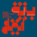
Inner Structures – Outer Rhythms

27.06.2024 –
05.01.2025
gggrafik design—slay allegories
Centre National du Graphisme, 1 Place Émile Goguenheim, 52000 Chaumont, France

20.07.2024 –
24.11.2024
Same Bold Stories?
Klingspor Museum,
Herrnstraße 80,
63065 Offenbach

31.08.2024 –
05.01.2025
German Design Graduates 2024
Museum Angewandte Kunst, Frankfurt am Main

04.10.2024 –
17.11.2024
FORMAT(S)
Strasbourg

23.10.2024 –
08.12.2024
Call for Submissions: Yearbook of Lettering 2

20.11.2024 –
21.11.2024
ADC Creative Club 2024
Design Zentrum Hamburg

28.11.2024 –
28.11.2024
DDC Salon NRW
NRW Forum Düsseldorf, Düsseldorf