Everybody uses them while speaking, avoids them when writing and removes them when correcting texts – filler words. “aber eigentlich” was developed…
The concept of “user friendliness” focuses on ease of use above all else. In order to achieve this, most websites use standardized…
Effective communication and education is the road to more tolerant communities. The idea is simply to create a fun & engaging way…
Anarchy in the age of the robots is a self-destructive variable typeface based on the manifesto of the same name by Narodnaya…
For a couple of years the draft of this font was around in our studio, originally exploring the possibilities of creating glyphs…
The typeface in this photographic series has been generated by extracting forms from the famous Jean Dubuffet’s Hourloupe pictorial works. Named Type…
OPUS is a fusion type project that combines pre-printed, pre-determined elements with physical materials in a ‘response’ or ‘reaction’ style lab. The…
„timewriter“ is an alternative, innovative time measurement system. It extends the known linear time system by an additional component of individual time…
Typographics project exploring the impact of nuclear testing at the Nevada Test Site in Nevada, USA. Image series exploring poetic data approaches…
Design has always been significantly influenced by technical possibilities. Today, programs and algorithms increasingly determine our way of visualizing and thinking. In…
The artistic intervention made by Andrea Gassner to mark the anniversary year quotes fragments from Wolf Huber’s most important visual work. Alone…
Treating the three dimensional grid in the second dimensional digital space was always an intriguing matter for graphic designers, programmers, creative coders…
After learning to do color prints from negatives in general, I did a lot of experiments in the darkroom and then eventually…
A vortex of words and an exercise with type. Endless, aimless, we dive in and use letters to yet again try to…
Based on the work of António Lobo Antunes
Poster made with the lyrics of the song "Samuel Mira" by Valete (Prod Baghira & Dr Neo Cortex)
Fragto a flexible typeface: Fragto is a titling font with an experimental concept. The font has three styles. Fragto is divided into…
For this exercise, I decided to play with the idea of mix and layer. As a graphic designer I am at a…
Non-normative letters for a non-normative future.
Bud Rodecker — Design Direction, Design Alyssa Arnesen — Design Graphic excerpt from a soon to be released uplifting identity.
John Pobojewski — Concept, Design Direction, Strategy, Design Nick Adam — Design One of three distinct brands designed to emphasize the differences…
Nick Adam — Design Direction, Designer Avery Branen — Designer, Illustrator Unselected identity direction for a new restaurant that is reinventing Nashville…
"Stripes Vertical" is a monospaced display font that I designed earlier this year. The founder and developers of a start-up focused on…
Bud Rodecker — Design Director, Designer Alyssa Arnesen — Designer, Typeface Designer Southwest Sans is a display typeface that was designed for…
Upcoming Events

25.04.2024 –
22.04.2025
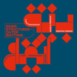
Inner Structures – Outer Rhythms

27.06.2024 –
05.01.2025
gggrafik design—slay allegories
Centre National du Graphisme, 1 Place Émile Goguenheim, 52000 Chaumont, France

20.07.2024 –
24.11.2024
Same Bold Stories?
Klingspor Museum,
Herrnstraße 80,
63065 Offenbach

31.08.2024 –
05.01.2025
German Design Graduates 2024
Museum Angewandte Kunst, Frankfurt am Main

04.10.2024 –
17.11.2024
FORMAT(S)
Strasbourg

23.10.2024 –
08.12.2024
Call for Submissions: Yearbook of Lettering 2

20.11.2024 –
21.11.2024
ADC Creative Club 2024
Design Zentrum Hamburg

28.11.2024 –
28.11.2024
DDC Salon NRW
NRW Forum Düsseldorf, Düsseldorf