GREY ZONE refers to a situation that is unclear or ambiguous. it pivots this original meaning to a more figurative one so…
During Mike's final exam, he designed and conceptualized ten display typefaces. Part of this work were 30 poster studies, which served to…
Zwiespalt is a poster that wants to aggressively showcase the political conflict on our planet. Highlight of the artwork is the huge…
The design and naming of Wagnis is inspired by the imperfectionism of the daring experiment the typeface is itself. Every glyph was…
Zelos is an experimental typeface that I created in 2020 which comes with a vertical and a horizontal style. The posters are…
For a music venue in London we built a modulator called SoundWaveMachine that transformed sound into a visual. We took various musical…
Perspectiva is a registered charity and a collective of scholars, artists, activists.We created an identity based on an isometric grid showing different…
The We:deutschland project is about German identity so each letter is made up of the three colours of the German flag (trikolore).…
8x8type is a typeface based on the 8 x 8 grid of a chess board. Each letter is made up of 32…
A box of pencils produced as a promotional piece for a box company. We designed a typeface and illustrations using pencil component…
The font is a playful extension of the type family Weissenhof Grotesk. Based on its Regular style a diverse collection of uppercase…
Ultimately, I'm trying to capture things that physically can't be captured in camera. I usually try to work photorealistically, that is, to…
Comm-unity is human
...и вовсе не друзья
I'm not sure how to ask, what to ask. I'm filled with questions rather than with answers. On my path to recovery,…
The poster aims to acknowledge in a cheeky way how these days, in the social networks era, creatives and designers 'get inspiration'…
The poster was created for the performance The Red Tree in the space of the Boyar Chambers. The main typography is based…
The “Vela”, as it is called by the locals, was designed in 2005 by Santiago Calatrava and was destined to host the…
The poster was made for the play Demons based on the novel by Fyodor Dostoevsky. Magic hand-made typography, emphasizing the "sinfulness" of…
I’ve been looking for a long time for an event to make homage to the marvellous poster «Frederik» by Erich Brechbuhl, when…
I first met Jacob Dahlgren when we worked together on his exhibition “Quality Through Quantity” at Museum Ritter in 2017. One of…
449.5 °F was commissioned by Fonderie Darling, a visual-arts venue located in a former foundry in Montreal. At the occasion of their…
Obsolete was a response to the fear of automation in the world of design
Upcoming Events

25.04.2024 –
22.04.2025
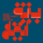
Inner Structures – Outer Rhythms

27.06.2024 –
05.01.2025
gggrafik design—slay allegories
Centre National du Graphisme, 1 Place Émile Goguenheim, 52000 Chaumont, France

20.07.2024 –
24.11.2024
Same Bold Stories?
Klingspor Museum,
Herrnstraße 80,
63065 Offenbach

31.08.2024 –
05.01.2025
German Design Graduates 2024
Museum Angewandte Kunst, Frankfurt am Main

04.10.2024 –
17.11.2024
FORMAT(S)
Strasbourg

23.10.2024 –
08.12.2024
Call for Submissions: Yearbook of Lettering 2

20.11.2024 –
21.11.2024
ADC Creative Club 2024
Design Zentrum Hamburg

28.11.2024 –
28.11.2024
DDC Salon NRW
NRW Forum Düsseldorf, Düsseldorf