Structural packaging design cover for RARITIES by Lorn. Its cover is made from a single piece of paper folded in such a…
The font came to light from the urge for a deeper understanding of technology, which is omnipresent in our daily lives. Therefore,…
The animated poster was created as a submission for the Heidelberg Symposium, part of the Heidelberg Art and Culture Prize, with its…
Design for the multi-day art festival Parade Créole — »Eigenkleider« for colonized bodies. An exhibition that brought together a variety of artistic…
We brought our vvvv-Buchstabengewitter-framework to the next level: Using it as a live typewriting commenting tool for our talks, which marries the old mechanical…
The word survivor and colour combination of black/white is a symbolic typographical interpretation of the situation we all went through the past…
This typography is drawn with a lath. The idea came from a photograph of a grocery store where the employee had drawn…
The Koruption typeface is the result of a questioning I have been having about Variable fonts. Rather than using this new technology…
The focus of her typographic work is obviously not on legibility, but on the design potential of the forms in the context…
Main title: Girls Love Girls love is an Egyptian movie about three sisters who never met, but are forced to live under…
My work is an experimental combination of bold colours with a handwritten text 'Die Qual der Wahl' which represents my personal struggle…
With a set of 1287 alternate glyphs, the Ekko typeface gives you tools to be creative. By combining these alternate glyphs between…
The word "desire" with a melting effect reminds us of a melting candle. Purple is burning desires that we always crave.
Ongoing Exploration on: How do we perceive form and space as letters ? How to combine shapes to trigger a visual memory?
TYPE MOIRÉ OFFSET / STARWARS is an artistic explorational process about one physical phenomenon, the wave interference; especially the moiré pattern, which…
I developed my first typeface, without much prior knowledge in 2019, following my own kind of learning-by-doing-process. My idea was to create…
Typographic design inspired by geometric ornamental patterns and textile technique developed by the Wichí community in Argentina. Textile technique of a single…
TYPE CODE / ORIGAMI is an experimental typographic poster. Contains the modified text of a Hungarian cookbook. Every letter's silhouette removed, only…
The letters of this alphabet were constructed using triangles of paper on a set grid. The shape of the triangle appears in…
AHORN is an analog variable font created in a seminar with Katharina Köhler at HfG Karlsruhe. Just as the glyphs of digital…
Larabic Is a font that merges Arabic and Latin letters in the same alphabet. EX Letter “T” and letter ت are both…
Ludo is a monospace font family based on a very strict 10 by 15 grid. My experiment was to create as much…
Imagine an E suddenly having four arms, or an U having more than just two stems. Why does a letter look like…
Typography being a living discipline, I wanted to draw a letter in an organic, imperfect way. I choosed the letter r for…
Upcoming Events
26.09.2024 –
31.12.2025
RÅW
Trapholt Museum of Modern Art, Kolding, Denkmark
22.02.2025 –
11.05.2025
Der Palast des typografischen Mauerwerks
Museum für Angewandte Kunst, Frankfurt am Main
01.03.2025 –
30.04.2025
Mut zur Wut 2025
09.04.2025 –
29.04.2025
Collective Cosmo: SET v.26
Gallery of the HBKsaar, Keplerstraße 3-5, 66117 Saarbrücken
01.05.2025 –
04.05.2025
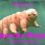
21st Pictoplasma Conference
silent green Kulturquartier, Gerichtstraße 35, 13347 Berlin
08.05.2025 –
10.05.2025
DIVE’25
Fat Cat in Munich, Germany
08.05.2025 –
10.05.2025
OFFF Festival 2025
Disseny Hub, Barcelona, Spain
09.05.2025 –
01.06.2025
Design Month Graz 2025
Graz, Austria
10.05.2025 –
18.05.2025
munich creative business week 2025
Munich, Germany
31.05.2025 –
31.05.2025
TypeParis Now 25
Novotel Paris Vaugirard Montparnasse 257 rue de Vaugirard , Paris
06.06.2025 –
06.06.2025
CXI Conference 2025
Bielefeld, Germany