ApocalypsA is a Hebrew-Latin Font. Based on their common historical origin, it combines similar sounds of the Hebrew and English-Latin alphabets in…
What is truth? What do you dare to do? Where does real understanding begin and where does it end? Visual identity with…
Bauhaus played an important role in the renewal of typography, as it reinterpreted the traditional canons. I would highlight three elements that…
Wassermusik is an ongoing typeface , that occurred as a byproduct while i was the creating a logo for a company that…
Hyper Sensual Reality is a fashion installation by Timo Kreitz that draws a connection between the sensuality and limitation of the physical…
My Best Italic Wishes is my contribution to “Best Wishes Italic” Collaborative Type Initiative by W Type Foundry, where a typeface of…
Joshua explores the sound’s visualization through a font family of three modular and variable typefaces, which include six styles. Inspired by Cymatics,…
"Insel (11m + 39m)" is composed of two notation levels containing a fragment of a telephone call time list, plus a dated…
"Einerseits (23m + 1m)" is composed of two notation levels containing a fragment of a telephone call time list, plus a contextualisation…
”Deep Times” is designed for the work “100,000 YRS”, that explores the complexity of communicating to humans or other life forms 100,000…
TYPOZONE is an exhibition series focusing on experimental typography, showcasing all Hungarian university students' works at Eger, Hungary. It is organised by…
Young Designers' Association at Budapest (FISE) made an exhibition for its 27 silicate (ceramics and glass) artist members. The curators (Ildiko Fazekas,…
DANCE could be a concrete poetry work of art, in fact it is located somewhere at the crossover of verbal meaning, typography…
“Yellow Pages” deals with visual and linguistic artifacts from 80s and 90s pop culture. The work is based on a personal visual…
The poster is based on a typographic surface. This text is interrupted with a geometric grid sequence, which fragments the basic text,…
Originally created for BUG MAG #3 of @klassethomas, the freedom issue, this work explores and addresses what freedom means and is all…
This poster series was created as part of the typography course of Prof. Dipl.-Des. Eva Kubinyi, in our 6th semester, with the…
text work experiments with quotes and/in patterns in simple/reduced color fields
Furnitype came about as a result of considerations on the relations between typography and the design of functional forms, on where its’ frontiers…
is a Typography format, which solely explores the aesthetic value of a black and white gradient on the letter D.
Using my name as a template, a new alphabet of five letters is being created in 3D.
Various custom type / letterings. (1A) For the little collaboration with The Templates (The Brand Identity). (1B top) For the collaboration with…
‘Kill the Beast’ is a poster made out from quotes from William Golding’s novel ‘Lord of the Flies’ (1954). The novel poses…
Focusing on the slogan "We Create Culture" of , we defined the value of the project as a culture, people, tradition/heritance, and…
Upcoming Events
26.09.2024 –
31.12.2025
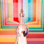
RÅW
Trapholt Museum of Modern Art, Kolding, Denkmark
22.02.2025 –
11.05.2025
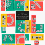
Der Palast des typografischen Mauerwerks
Museum für Angewandte Kunst, Frankfurt am Main
01.03.2025 –
30.04.2025
Mut zur Wut 2025
09.04.2025 –
29.04.2025
Collective Cosmo: SET v.26
Gallery of the HBKsaar, Keplerstraße 3-5, 66117 Saarbrücken
01.05.2025 –
04.05.2025
21st Pictoplasma Conference
silent green Kulturquartier, Gerichtstraße 35, 13347 Berlin
08.05.2025 –
10.05.2025
DIVE’25
Fat Cat in Munich, Germany
08.05.2025 –
10.05.2025
OFFF Festival 2025
Disseny Hub, Barcelona, Spain
09.05.2025 –
01.06.2025
Design Month Graz 2025
Graz, Austria
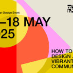
10.05.2025 –
18.05.2025
munich creative business week 2025
Munich, Germany
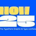
31.05.2025 –
31.05.2025
TypeParis Now 25
Novotel Paris Vaugirard Montparnasse 257 rue de Vaugirard , Paris
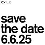
06.06.2025 –
06.06.2025
CXI Conference 2025
Bielefeld, Germany