Typeface of the Month: Giramisu
By phospho
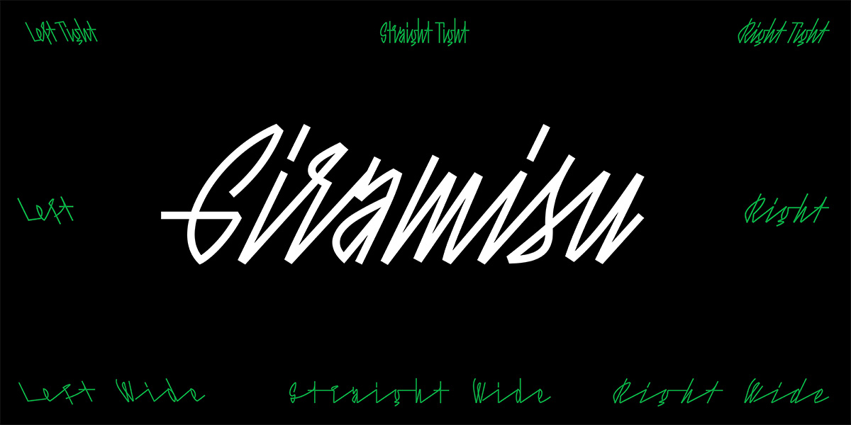
Check out our newest Typeface of the Month: Giramisu!
Giramisu is an edgy monoline script font, taking a formal approach from 20th-century neon signage towards a present-day display typeface. If there’s one defining characteristic, it is: urbanity—seamlessly combining the formal language of neon sign makers with the self-expression of urban tagging.
Technically, Giramisu is an incredible shape-shifter that expands from Tight to Wide and tilts from Left to Right, ranging from -26 to 26 degrees. Most of the letters connect throughout the entire design space, but—in the dictation of a funky rhythm—certain pairings in the tighter states do not. These stylistic gaps are bridged only in wider conditions to ensure legibility. Explicit fitness for all-caps text setting is given by its own set of isolated capitals.
Typeface of the Month: Giramisu
Foundry: phospho
Designer: Roland Hörmann
Release: May 2024
Formats: otf (Static), ttf (Variable), woff, woff2
Prices: Single style: € 23, Complete Family: € 60; Variable: € 60


