UNICEF: History of a Logo
Redesign for the 75th Anniversary
From the child drinking milk to the mother lifting her child: The UNICEF logo has changed a lot over the past 75 years since UNICEF was founded. Therefore we would like to take you on a little discovery tour of how their logo has evolved over the years: UNICEF: History of a Logo.
UNICEF (United Nations Children’s Emergency Fund) works in over 190 countries and territories to save children’s lives, to defend their rights, and to help them fulfill their potential, from early childhood through adolescence.
1946
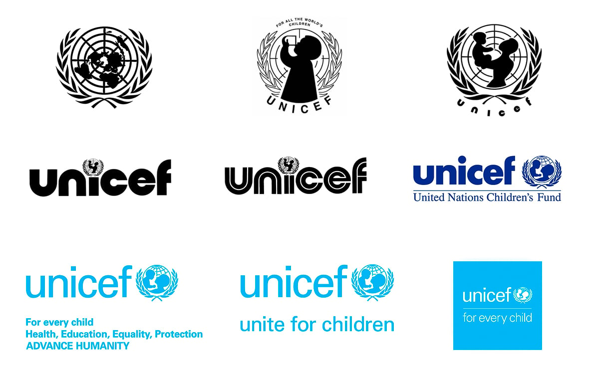
UNICEF is created by resolution 57 of the United Nations General Assembly on December 11th, 1946, to provide supplies and assistance to children after World War II. Originally known as the United Nations International Children’s Emergency Fund, UNICEF starts as a temporary relief fund of the United Nations. As such, it is entitled to use the UN logo.
1953
In October 1953, the United Nations General Assembly extends UNICEF’s mandate indefinitely to assist vulnerable children. As a UN agency with a distinct mandate, UNICEF develops its own visual identity.
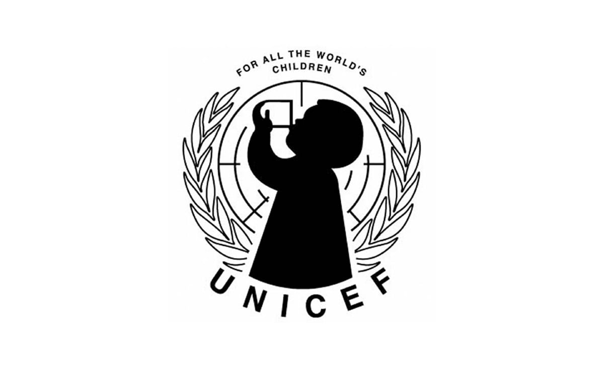
UNICEF’s first logo features a child drinking a cup of milk, which reflects the organization’s main activity at the time: delivering milk to children. This logo retains some elements of the UN logo, on which it is based, such as the olive branches and globe in the background. “A child drinking milk” becomes the symbol of UNICEF.
1960s
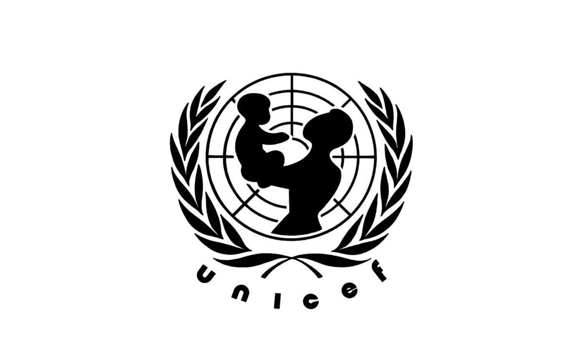
As UNICEF’s focus expands to include the wider needs of children, the organization’s logo changes as well. In the 1960s, “a child drinking milk” is redesigned as “a mother lifting up a child.” This is also linked to the UN adoption of the Declaration of the Rights of the Child in 1959, which defines children’s rights to protection, education, healthcare, shelter, in addition to good nutrition.
The universal gesture of a mother lifting up a child symbolizes the hope, security and joy that UNICEF’s work gives to parents and their children. This gesture evokes parents’ energy and enthusiasm, which reflects UNICEF’s optimism and the results we seek to deliver for every child.
1975
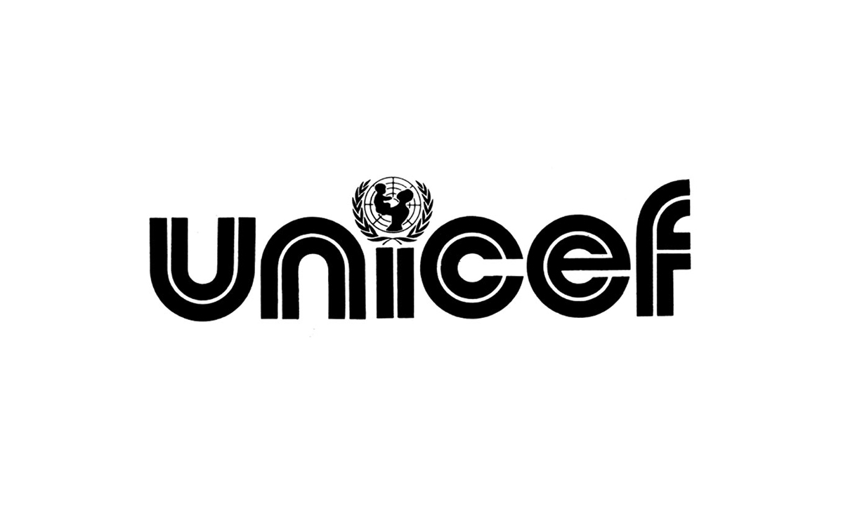
A standard global logo is issued, which retains the “mother and child” emblem as the dot on the “i” of “unicef.” This is the first version of the UNICEF logo to be registered with the World Intellectual Property Organization.
1978
While the key elements of the 1975 logo are retained, the typeface is revisited to align with some prevailing visual trends of the time.
1986
In 1986, coinciding with UNICEF’s 40th anniversary, the logo changes again: the typeface becomes Futura Bold and the color goes from black to PMS Reflex Blue. UNICEF issues The Identification Graphic Standards Manual, the organization’s first Brand Book.
The logo features UNICEF’s name, in lower case and heavy typeface, alongside the “mother and child” emblem. The design approach is aligned with the Swiss Style of the time, minimalist in nature. This logo is seen as clearer compared to previous versions, lending itself better to universal recognizability and clarity.
2001
In 2001, the UNICEF logo as we know it today is introduced—along with guidelines for its use on multiple platforms. The color is changed from PMS Reflex Blue to PMS Process Cyan. The undiluted colors of the new UNICEF brand color palette (cyan, yellow, pink, and violet) are meant to evoke the vibrancy of children.
The logo is stylized and simplified. The “mother and child” emblem is modernized to reflect a more generic figure.
2008
UNICEF’s tag line becomes “unite for children.” Previously, this call to action had been used for UNICEF’s campaigns, in addition to “unite against AIDS” and “unite for peace.”
The transition of “unite for children” from a campaign tag line to the brand signature emphasizes UNICEF’s advocacy role in support of the Millennium Development Goals and the Convention on the Rights of the Child. “Unite for children” communicates how the organization brings partners together across sectors to achieve results for children.
2016
In 2016, “for every child” is adopted as the organization’s brand strategy and becomes part of the logo. “For every child” echoes UNICEF’s universal mandate to protect the rights of children everywhere—and embodies the organization’s mission to give greatest priority to the most disadvantaged children.
Modularity is a key component of this new logo. “For every child” is just the first half of the brand statement. The second half includes words that showcase the scope of UNICEF’s work. For example, “for every child, hope,” “for every child, opportunity,” and “for every child, dignity.” This logo enables us to highlight the challenges children face, as well as the hopes we have for them.
2021
In December, UNICEF will be 75 years old. To mark the occasion, they have added the number 75 to the existing UNICEF logo.
The bold “yes” stands for a positive, forward-looking view of the organization and its many supporters. The 75-year logo replaces the “normal” UNICEF logo in Germany in the birthday year—both internally and, above all, in external communications.
UNICEF: History of a Logo
Text: Research and writing by Martina Tomassini, Ruthia Yi and Susanne Nandelstädt
For more information visit the UNICEF website
