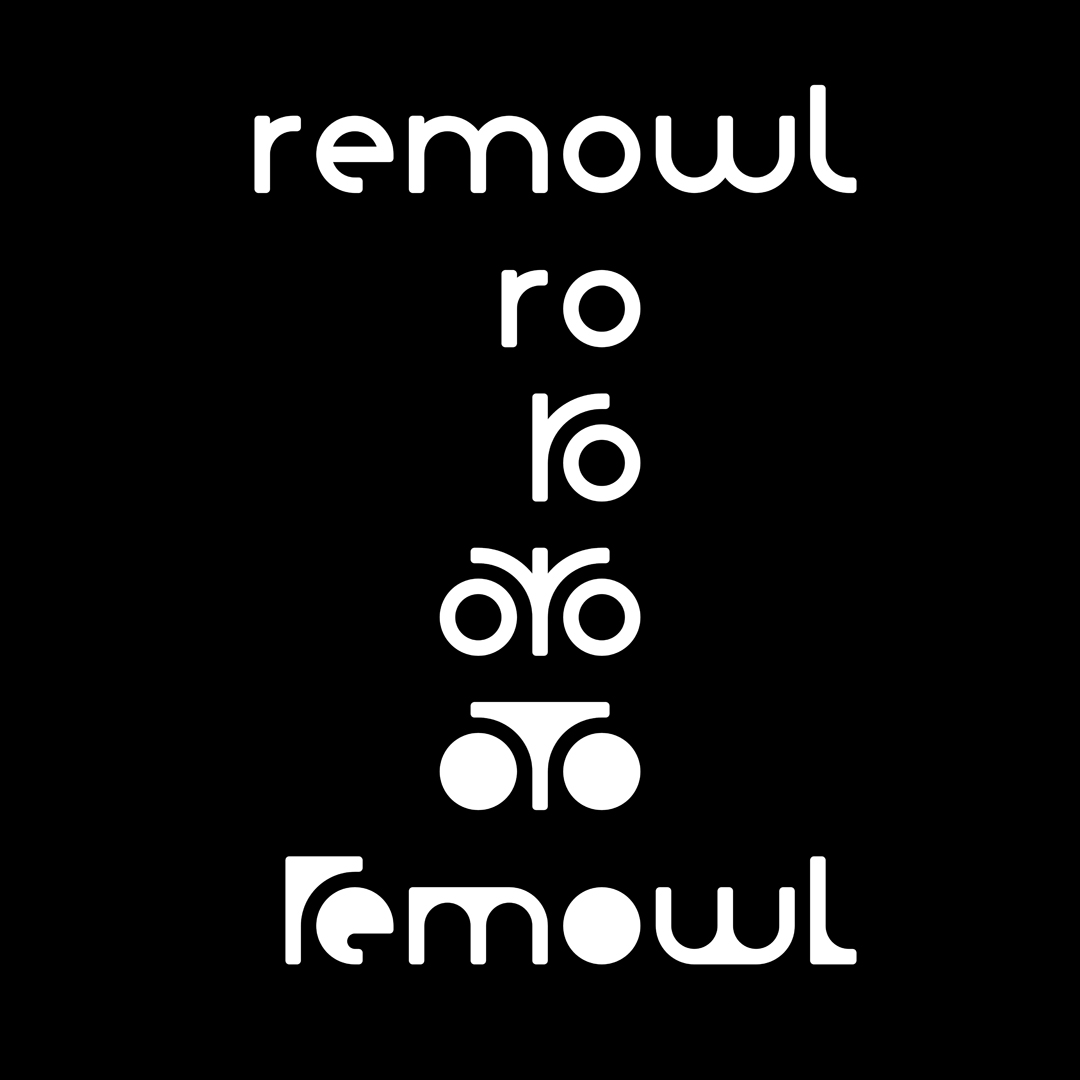
untitled font (as of 07/2024)
This set of characters is the result of a logo design that rem owl just recently did for their online presence. Said logo is derived from the letters r and o. A massive version sparked the idea of filling voids (like the o) and crotches (like the area between the r's stem and arm) for all letters and numbers. Another idea that came from the logo design was letting suitable letters partially wrap around a neighboring letter and thereby create interesting geometric situations
