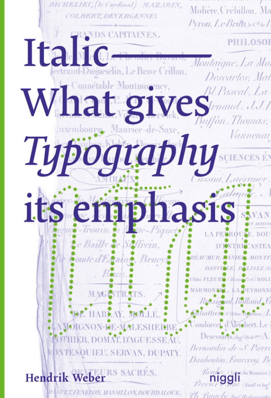
Italic. What gives Typography its emphasis
The use of italic letters for accentuation has become a common practice in the digital age. Italics convey movement and dynamics, address the emotional experience of reading and remind readers of handwriting. Their lively nature – once the result of handwritten movements – becomes noticeably lost once words are tilted at the click of a mouse.
To spread more knowledge about this typographic feature and arrive at a general definition of the script style, Hendrik Weber has compiled stylistic examples presenting the tangible forms, characteristics and functions of the ‘italic nature’. Furthermore, he deals intensively with the historical development of italics from handwriting to digital typesetting.
The monograph Italic. What gives Typography its emphasis is the first detailed treatise on the topic. It is for everyone passionate about letters.
Niggli
Hendrik Weber
128 pages
15.8 x 23.5 cm
English
Softcover with flaps
978-3-7212-1009-5
12/2020